WebTOC Browser Extension Development Journey
Welcome to download this extension from the Chrome Web Store.
This is a browser extension that can fetch the outline of the current web page.
The initial idea for this extension came from the book How to Read a Book, which mentions using a book’s table of contents and outline to quickly grasp its content.
When browsing online, it’s common to encounter websites without a quick navigation outline. For example, on my blog site, I believe a good blog post should be engaging and narrative, rather than having a clear, structured hierarchy like Wikimedia. So, I removed the table of contents from my blog.
However, there are times when we want to quickly assess whether an article is worth reading further or locate a solution without delving into the details. A browser extension that fetches the outline of any web page would be an excellent solution.
Initially, I designed a floating window for the current page. Users could freely move and resize this window, ensuring that the outline doesn’t obstruct the web content, thus maintaining a good reading experience.
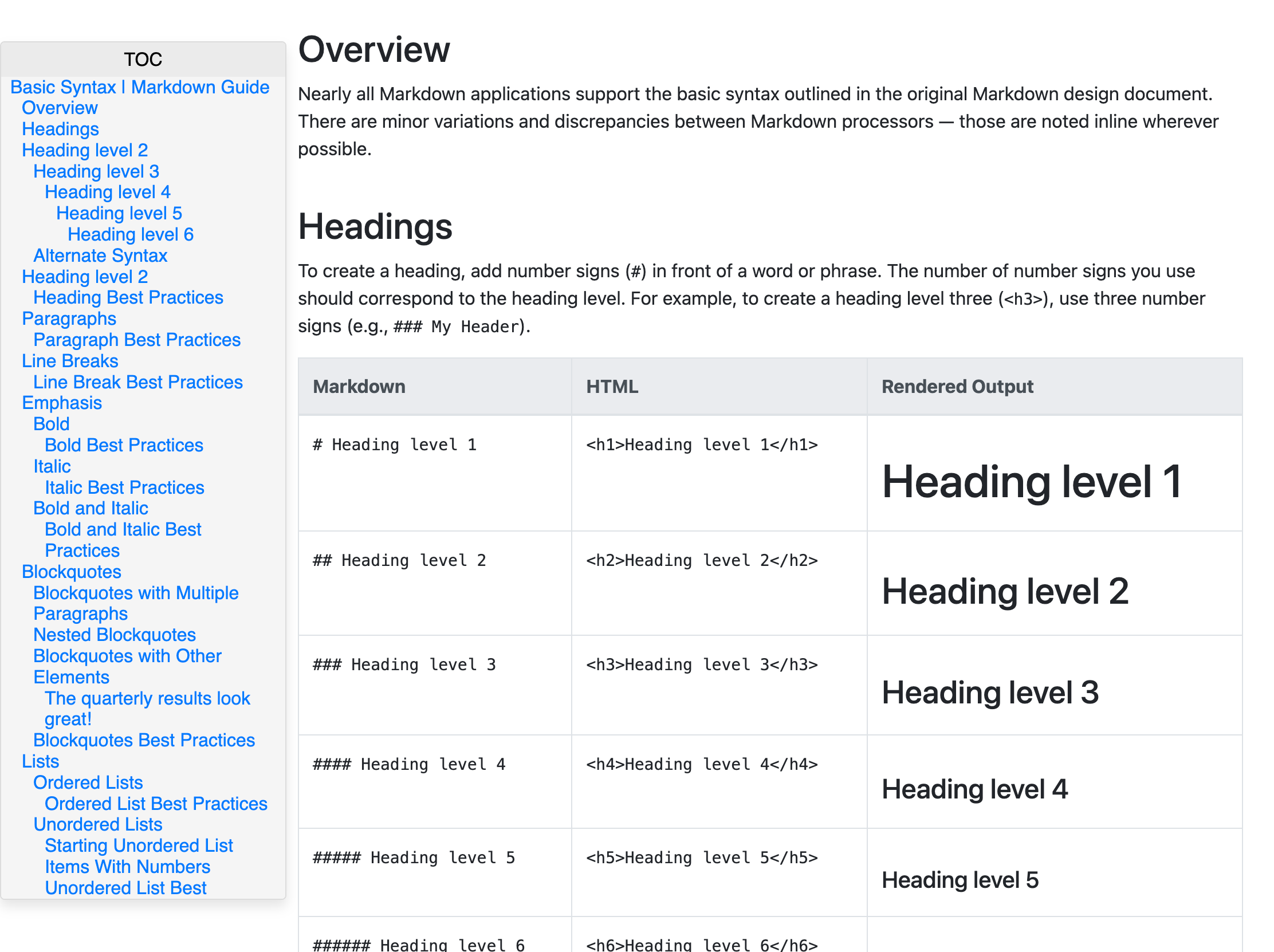
Here’s a screenshot of the first MVP.


The control bar at the top was initially inspired by the MacOS system, featuring a close button. Later, the close button was moved to the badge.
This is a demo of the control bar during the development phase, hosted on CodePen: https://codepen.io/huyixi/pen/OJeVyYE.
Additionally, the extension’s background was optimized. It adapts to the background color of the current web page, ensuring a better visual experience. The approach involves extracting the page’s RGB color, converting it to HSL, and then reducing the lightness (L). The background lightness is decreased by 4%, and the control bar by another 4%, resulting in a more pleasant color scheme.
At this point, the extension was nearly complete and met my needs.
However, while browsing at home over the weekend, I came across a tweet from a user named galala_eth:
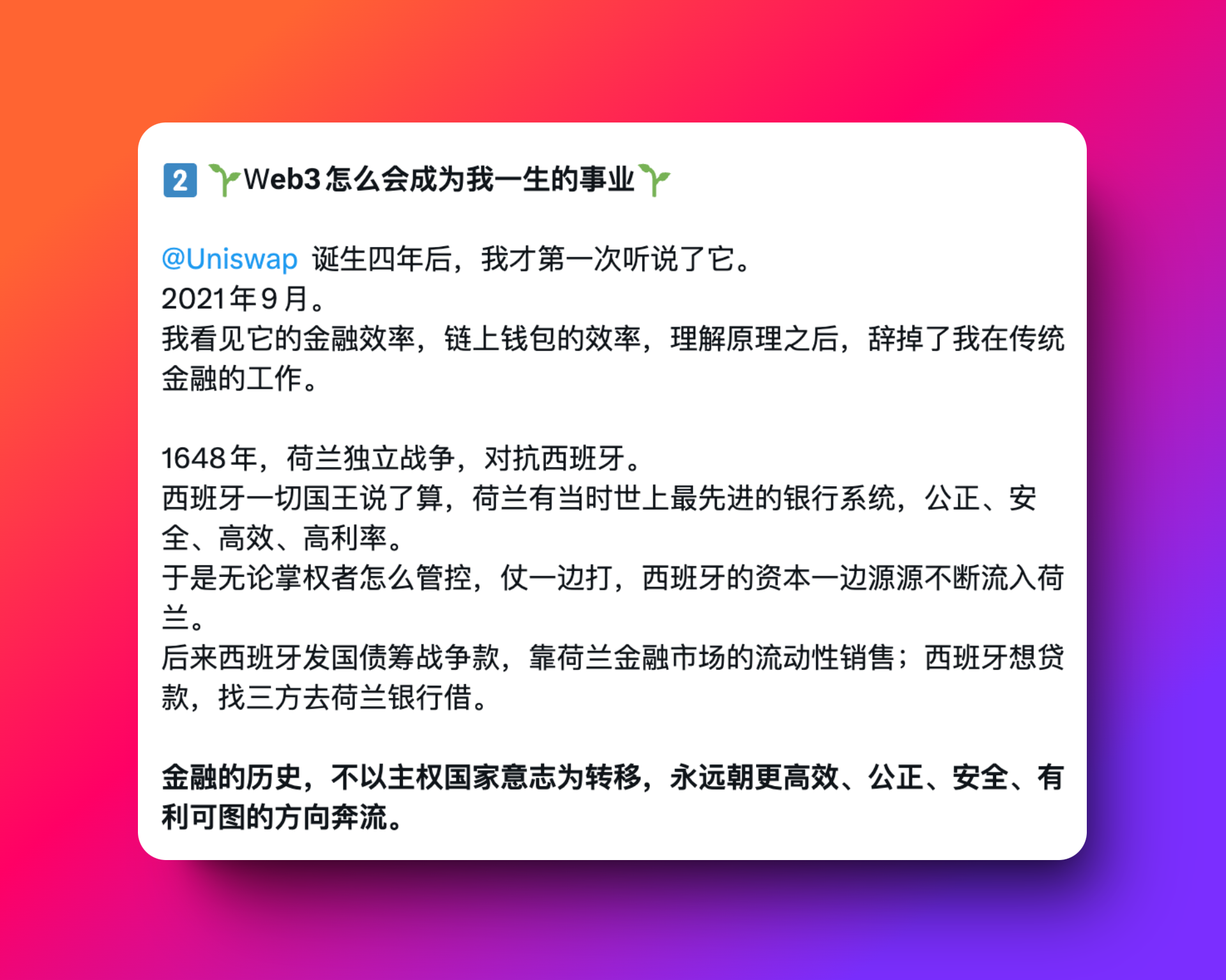
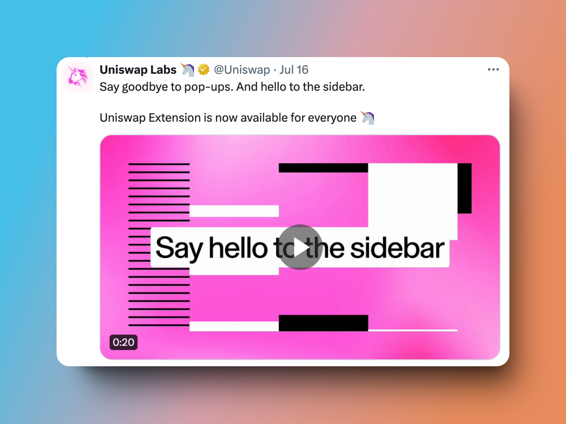
The tweet mentioned a tool called Uniswap, which piqued my curiosity. I checked it out and found that the first pinned tweet described their browser extension, which now displays content in a sidebar.
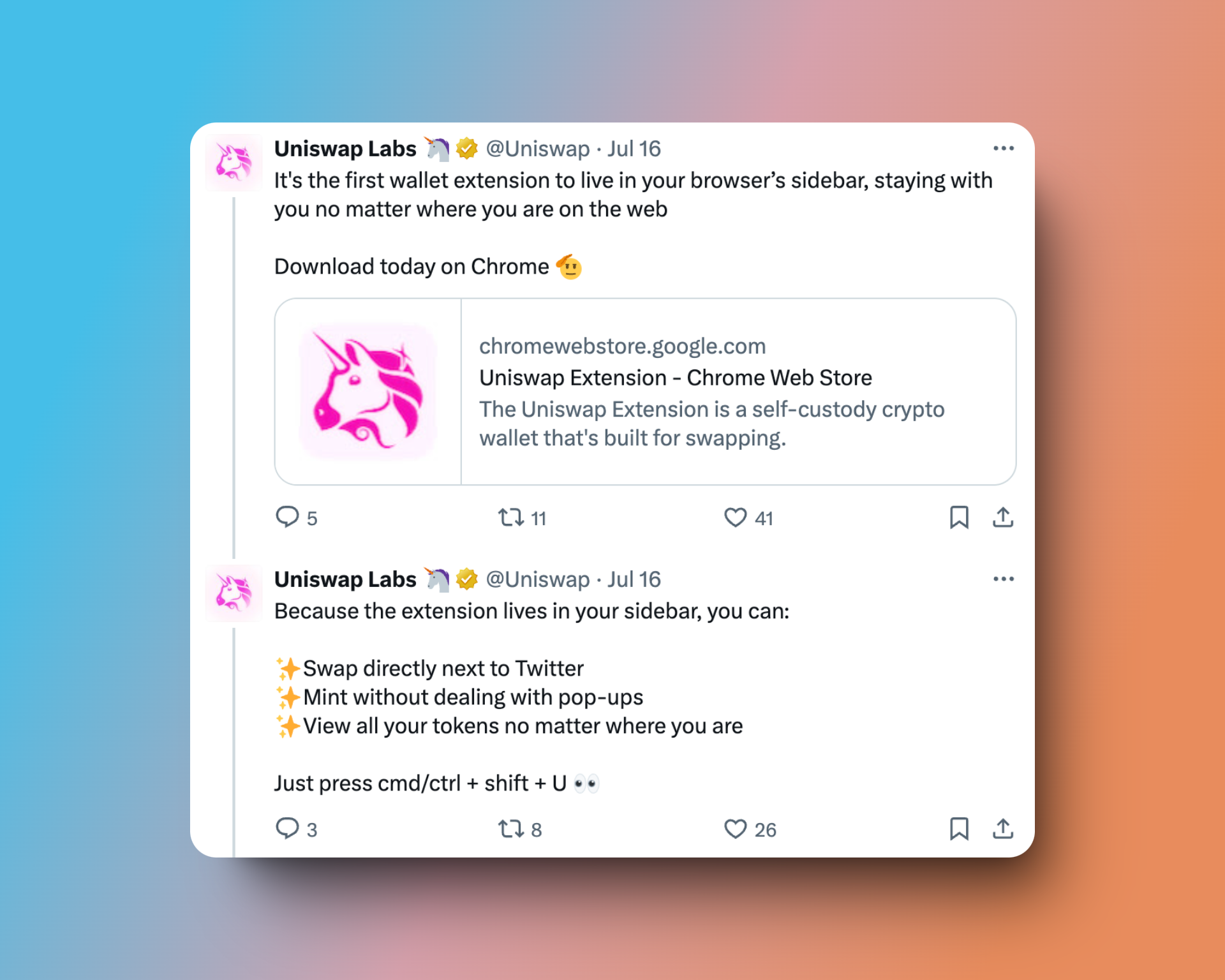
It was the first wallet extension to use this method. It struck me as a great display method, prompting me to scrap the previous code and start over.
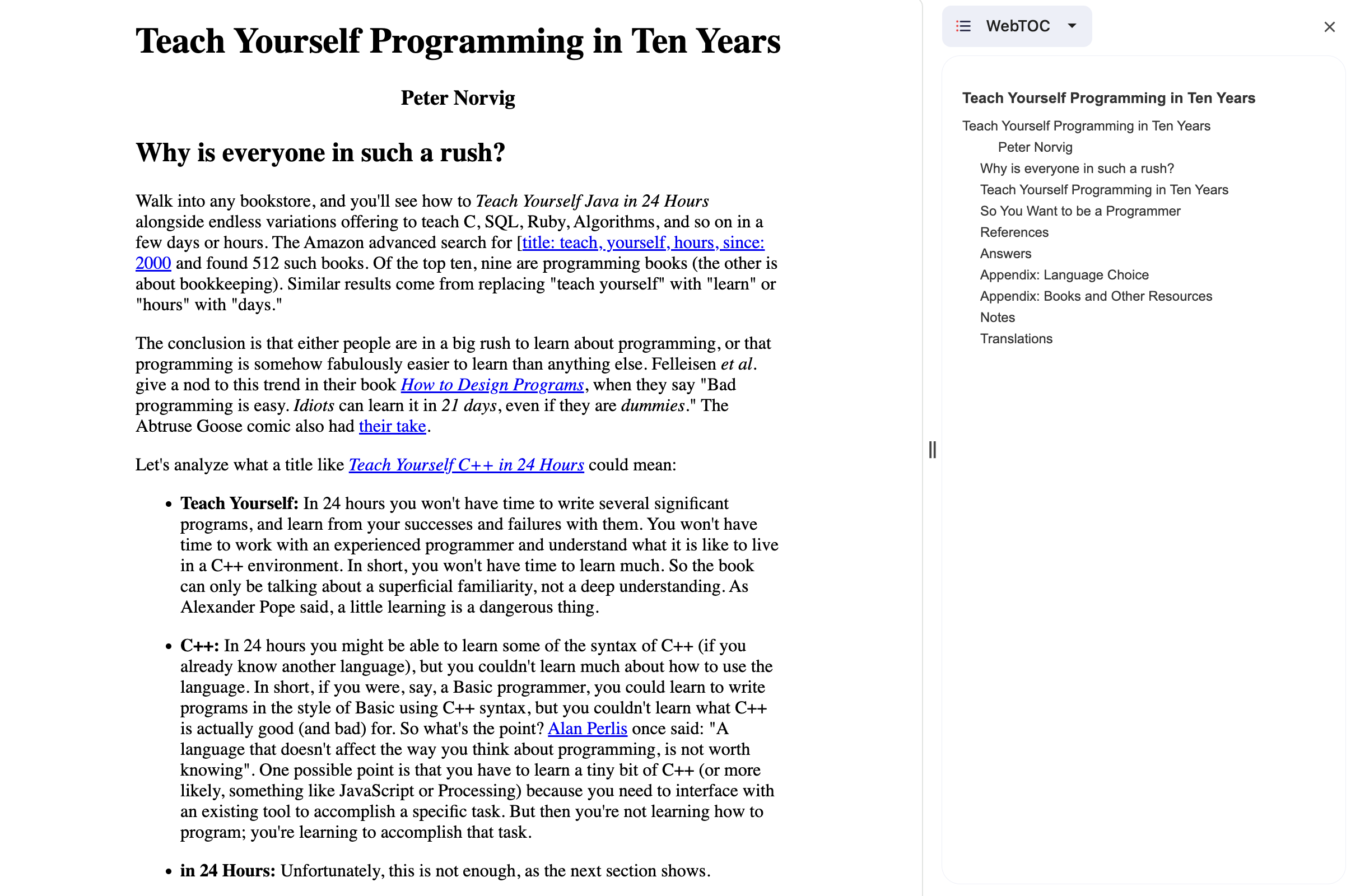
This is the current display effect. The screenshot is taken from Peter Norvig’s famous article Teach Yourself Programming in Ten Years, with some distracting elements removed.
The project is currently under review in the Google Store.

Once the review is approved, a download link for the extension will be provided.
Pitfalls Encountered
- Incomplete Documentation Review: Initially, I didn’t thoroughly go through the Chrome Extension developer documentation. As a result, the use of badge and sidepanel APIs was added later in the development process.
- Overemphasis on Clean Code and Project Structure: In pursuit of clean code and a well-organized project structure, I spent a significant amount of time stuck on certain aspects.
Roadmap
- Resizable text in the outline
- Highlighting the current title lastmod: 2024-11-15
- Using the current webpage’s link colors